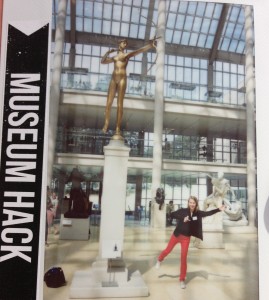
Museum Hack: A Critical Reframing of the Museum Experience
Posted on October 25, 2013 | posted by:By Mollie West, Transdisciplinary Design MFA ’15
“Everyone should first connect to the Met’s free wifi, and then let’s all bring it in for a group cheer…. Ready? On the count of three, we’ll put our hands in to the circle and yell ‘MUSEUM HACK!’”
Early one Sunday morning this September, I headed up town to meet one of my fellow Transdisciplinary Design classmates on the steps of the Metropolitan Museum of Art. We’re both fans of museums (hence why we were willing to cheerfully come to a museum at 10am on a Sunday), but this particular morning, we were invited to the Met to test out and give feedback for a new kind of museum experience known as a “Museum Hack.” The name brings to mind a nerdy hackathon filled with coders or gamers sitting in a dark museum archive, but in actuality, a Museum Hack is simply a reframing of a an old-fashioned museum tour. It reminded me of Jamer Hunt’s explanation of one of the central practices of Transdisciplinary Design: a critical reframing of a situation to reveal new possibilities.
The founder of Museum Hack, Nick Gray, took an outsider’s perspective on the typical museum tour and brought fresh eyes to the situation. In essence, he redesigned the Met museum tour to be participatory, user friendly, and technologically synced. As a long time fan of the museum, Gray started offering free short tours to his friends focusing on just a few items in the museum. He’d point out the 10 things he loved the most at the Met, along with the three things he would steal, if given the chance! As Gray took photos of the tours and spread the news through social media, the new communication technologies of the past decade allowed him to move beyond the network of his friends and into a larger online locality of museum-goers. In essence, he collaboratively mapped and connected the museum lovers across Manhattan[1].
Gray started his tour business, a business that would not have been possible to grow so quickly without the digital graffiti[2] of Instagram, Facebook, and Yelp. Gray then hired his business partner, Mark Rosen, a museum education expert. In a Wall Street Journal interview, Rosen explained, “You typically don’t go to a fancy restaurant, study the menu for three seconds, order everything, gorge yourself and roll out the door,” Mr. Rosen said to his Sunday-morning charges. “Yet almost everybody comes here, tries to see everything in four hours or less, Instagrams the hell out of the place and leaves, remembering nothing.” He’s describing the overloaded feeling we have when we enter a museum as extensive as the met. It’s the same way we feel about the information overload we get everyday from technology: “unfiltered, unsorted, and unframed. We lack ways to select what’s important. The design task is to make information digestible, not keep it out.”[3]
My Parsons’ classmate and I, along with ten other visitors, joined our guide inside and spent the next two hours on a high energy adventure roaming the halls and inner sanctums of the Met. Using the Met’s Wifi, we took photos and shared them online, tagging them and creating a sense of shared space around the Met. As technology theorist Thackara describes Bryant Park as a “wireless park,[4]” the Met is now a wireless museum.
Gray disregarded all rules about how museum tours should work, and started with his own appreciation and excitement for the museum. This unexpected insight—that museum tours don’t have to be all-inclusively encyclopedic, boring, or even affiliated with the actual museum—along with the bottom-up, participatory nature of the tour have created a fast-growing new museum experience.
What if we viewed museums as spaces for digital sharing and communal collaboration? Thackara writes, “Innovation thrives in conditions of diversity, not efficiency, and spaces designed for a single function—be it movement, sport, entertainment, or culture—are unlikely to foster innovation.[5]” The Met was originally designed solely for culture, but Gray is adding movement (running through the halls) and entertainment (silly group photo shoots), ultimately adapting the Met into a new space that will evolve with the needs of the next century.
I venture that in the next few decades, we will see similar “Hacks” of other institutions… Imagine a hack of a school, hospital, government administration office, or a recycling system. How could we redesign these institutions to engage the user in ways that they are traditionally not engaged? How could we incorporate user participation, a sense of joy and play, and conditions of diversity into the institutions in need of a redesign? By using the same design principles Gray used for the Museum Hack, it is exciting, rather than overwhelming, to this about the possibilities.
