“Data is the new soil” and data visualization is our new tool !
Posted on December 3, 2012 | posted by:Why write an article about the data visualization. It’s first of all a personal choice. Indeed, when I was young, what i prefered in my textbooks was the graphics and the map explaining the world and the society. And this is one of the things that brought me to study the design. But an article about this subject is also necessary because it became a kind of trendy thing to use the infography and i think it’s important to reflect on it role and its fundamental fonction.
Organize the information became a undeniable requirement.
We live in a world where the information is everywhere anytime. The human is interested not only by the life of his neighbourhood, his city or his country, but the life’s world. At first the television deleted the idea of frontier and get into homes the real-time information, then the internet continue the tendance by multiplying the data again and again.
The ideal would be to have access to complete but synthetic hierarchized data.
And it’s precisely the amazing challenge for the designers, collect data about the world, the society, the customs, the science and make them visible and clear for all.
The designer has the desir to turn to subjects they don’t know about and to tackle its complexity with the purpose of simplify it.
David McCandless, a very good infographic designer, explained he needed 2 months to make a double page visualization of his book because of the amount of data to process. And all for what ? hundred and hundred people who in a jiffy realize a phenomen, learn things about an unknown subject, see with a new eye things they thought taken for granted.

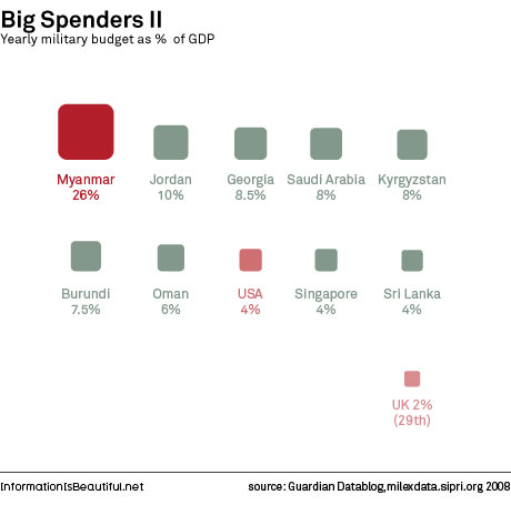
In a world where everything is relative, the data visualization is our tool ! Indeed it links things, compares them, confront them also. The american army what has so-called the biggest budget in the world, ranks number 27 when this budget is compared to the PIB.
To the visualization’s content is added the art of put into images data. It’s a mastery I admire cause ase a trick, everything become simple, ludic and attractive. And of course, it’s not just a question of aesthetic, the form have to further the content (already so complex), the forme must speak by itself and indicate a direction at a glance.

The translation into image of data allows a new way to read the information.
The text impose a beginning, an end, a read direction, the same for the documentary. An image can give only one aspect of the reality. The data table doesn’t allow to have a overall view.
The visualization allows a new way to read. We have the possibility to lost oneself inside, to go into many details, then come out of it at any moment to stand back from it. What’s incredible : it’s the media the most adapted to our brainpower.
As explain McCandless :
« The eye is exquisitely sensitive to patterns in variations in color, shape and pattern. It loves them, and it calls them beautiful. It’s the language of the eye. If you combine the language of the eye with the language of the mind, which is about words and numbers and concepts, you start speaking two languages simultaneously, each enhancing the other. So, you have the eye, and then you drop in the concepts. And that whole thing — it’s two languages both working at the same time. »
Finally, I would like to introduce you a new line of research what could be the object of a new article. Hans Rosling, a master of the data visualization said : « Let the data set change your mindset ».
He realized a conference about this subject, and i believe that it could be interesting to ask now what is the influence and the conséquences of this new form of communication and exchange ?
http://www.ted.com/talks/hans_rosling_at_state.html
As we say in France : Un dessin vaut mieux qu’un long discours ! A picture is worth a thousand word !
A link to the MacCandless TED talk to go any further :
http://www.ted.com/talks/david_mccandless_the_beauty_of_data_visualization.html
He also published a very interesting book :
Information Is Beautiful. Published Feb 2010 by HarperCollins UK